
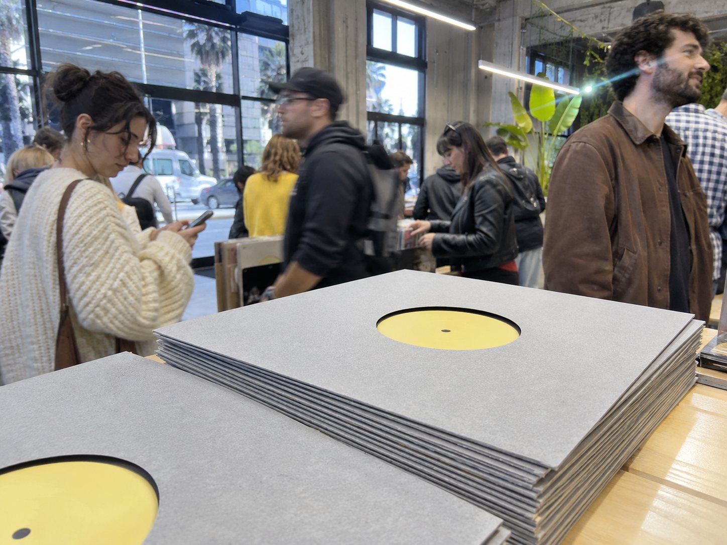
The house sleeve
Jonas Weber on the GLB sleeve: the die-cut, the board and four years of matching one shade of yellow.
Mark Neilson asked me in 2019 for "something plain". Clients often say this when they do not want to pay for a second colour, but it was also a good question. What is the least you can do to a 12 inch sleeve and still have it be yours?
The answer was a hole. A die-cut centre shows the label, so the sleeve does not need to say anything about the record, and the same sleeve works for every release. That matters to a very small company, because you print once, in bulk. The first run was 1,000 sleeves for a 300 copy pressing, which took Mark about three weeks to accept.
The board
The board is an uncoated recycled stock at 300 gsm. It is slightly grey with visible flecks, and every batch is a little different, which I like and the printer apologises for. A coated board would look cleaner on the first day. But a record sleeve lives in a box and is pushed in and pulled out, and uncoated board softens at the corners the way a book does, where coated board cracks along the fold and shows white.
The die is a steel rule in a block of plywood. It cuts at 104 mm, which leaves a small margin around the label so the hole does not cut across the text when the record shifts in the sleeve.
The yellow
The centre label is stone yellow. That is not a Pantone name. It is what I called it in the first email, and it stuck. It is roughly the colour of limestone on an old building in late afternoon, and on a grey board it looks warm without drawing attention to itself.
It has been the hardest part of the job. A record label is baked before pressing to dry out the paper, then goes into the press at something like 150 degrees with hot vinyl behind it, and the ink changes. Nobody can say exactly how. Press run three came back the colour of English mustard. "Karl-Heine" is slightly green next to "Traboules". I now send a corrected ink formula with each order, and the results are closer than they were.
The type
There is one typeface, a grotesque based on an old Berlin foundry design, in two weights. The catalogue number is always the largest thing on the label, because that is what someone in a dark booth is looking for. The title is small.
There will be one exception. Ilse Morgen is a working type designer and has asked to draw the lettering for her next sleeve. I took a day to think about it and agreed.
The Round compilations have their own treatment, a printed dial around the hole, which began with Round 2.